Review ampliSeqRNA plugin results

The ampliSeqRNA plugin generates an initial summary report that lists the samples, the number of mapped reads, the percent of valid reads, and the percent of targets detected. A series of log2 reads-per-million (RPM) pair correlation plots are included for rapid correlation analysis. Microsoft™ Excel™-compatible reports are also generated, including differential expression tables. Additional details about read coverage are also provided on a per-barcode basis, along with a list of gene annotations for each sequenced region.

After the sequencing run completes, review the plugin results in the report summary.

  1. In the Data tab, click Completed Runs & Reports.
  2. In the list of runs, locate the run of interest, then click the link in the Report Name column.
  3. In the left navigation menu, click ampliSeqRNA to view the plugin results.
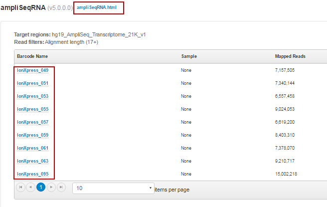
    • Click the ampliSeqRNA.html link to open the ampliSeqRNA Report – Barcode Summary for all barcodes.

    • In the barcode table, click individual barcode names to see the results for an individual barcode.

    • Click the Distribution Plots, Correlation Heatmap, Correlation Plot, and Gene Heatmap tabs to review the data graphically.

      Graphical report

      Description

      Distribution Plots

      Reads Alignment Summary

      A graphical summary of the number of mapped and unmapped reads across barcodes, as reported in the Barcode Summary table.

      Distribution of Gene Reads

      Distribution of genes across barcodes showing the frequency of numbers of genes having similar log10 read counts. All curves are plotted on the same axis scale. The counts data are fitted to a Gaussian kernel using the default R 'density' function.

      Correlation Heatmap

      A heatmap of Spearman correlation r-values for comparing log2 RPM reads pair correlation barcodes, with dendrogram reflecting ordering of barcodes as being most similar by these values.

      Correlation Plot

      Barcode read pair correlation plot

      Lower panels show log2(RPM+1) values plotted for each pair of barcodes, with linear least squares regression line overlaid and line slope reported. Upper panels show Pearson correlation r-values for the regression line. Diagonal panels show the frequency density plot for the individual log(RPM+1) values for each barcode. (If only one barcode has reads, a density plot is displayed.) Click the plot to open an expanded view.

      Gene Heatmap

      Gene Representation Heatmap

      Displays 250 genes showing the most variation in representation across barcodes as measured by the coefficient of variation (CV) of normalized read counts for genes that have at least one barcode with at least 100 RPM reads, plotted using log10 of those counts. For this plot, barcodes are omitted if they have <105 total reads.

    • Click the links at the bottom of the report to download associated report files.