
Example charts generated by the coverageAnalysis plugin
Many of the charts in the detailed Coverage Analysis Report include a Plot menu that allows you to change characteristics of the chart. For example, you can show both strands (see callout 3 in Figure 5).
The
 button (in the top right corner of a chart) opens the chart Viewing Options panel. The
 button opens a description of the chart.
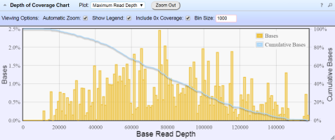 Figure 1. Representative Depth of Coverage Chart
The Depth of Coverage Chart shows the distribution of targeted base coverage. The X‑axis represents the base read depth. The left Y-axis represents the number of reads at a given base read depth or a range (bin) of base read depths, as a percentage of the total number of base reads. The right Y-axis represents the cumulative count of the number of reads at a given read depth or greater, as a percentage of the total number of reads. The individual orange bars represent the percentage of reads in the specific range of base read depths. The blue curve measures the cumulative reads at a given base read depth or greater. If your analysis includes a regions of interest file, this chart reflects only target regions (reads that fall within a region of interest).
In most charts, you can click a data point to open a detail pane for that data. For example, in the Depth of Coverage Chart in Figure 1, click an individual orange bar to open the detail pane for bases within a specific range of base read depths. Click a point on the blue curve to open the detail pane for cumulative bases at that base read depth or greater. For example detail panes, see Figure 2. Similarly, you can click any point or bar within the Amplicon Coverage chart to view details for each amplicon coverage bin (see Figure 4).
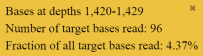
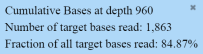
 Figure 3. Representation Plots
Use the Display list to view different amplicon representation plots. This figure shows an example Pass/Fail vs. Target G/C Content plot.
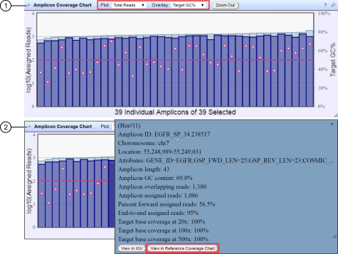 Figure 4. Representative Amplicon Coverage Chart
The Amplicon Coverage charts summarize the amplicon coverage results. Several plots views are available. The X‑axis in all plots represents individual amplicons. The left Y‑axis in all plots represents assigned reads (on a base 10 log scale). Use the Plot and Overlay lists to customize the chart view. The right Y‑axis varies depending on the plot view that is selected from the Overlay dropdown list. Click on any bar or any point on the chart to view the detail pane for that data.
-
Example Total Reads plot with a Target GC percentage overlay
-
Click on the bar to open the detail pane for the specific amplicon. Click View in Reference Coverage Chart to zoom in on the amplicon in the Reference Coverage Chart (see callout 3 in Figure 5).
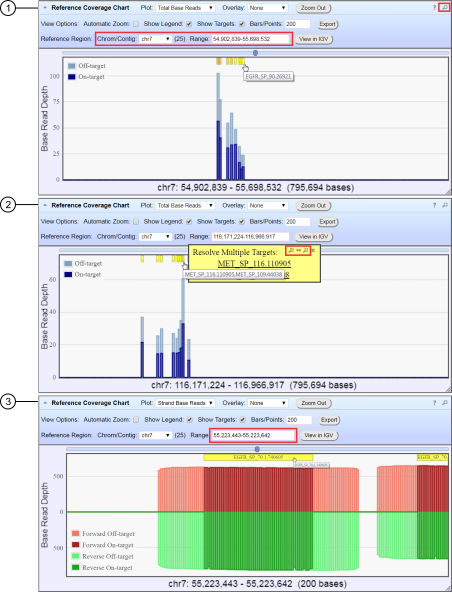 Figure 5. Representative Reference Coverage Chart
The Reference Coverage Chart is an overlay of where target regions are defined and overlap on the reference. The X‑axis represents the target region chromosomal position. The Y‑axis represents the Base Read Depth.
-
Example Total Base Reads plot with Viewing Options panel expanded. The plot is zoomed in on a specific chromosomal region. Click a yellow bar (top of the chart) to open the detail pane for a specific amplicon in the Amplicon Coverage Chart (see callout 2 in Figure 4).
-
Example Total Base Reads plot where a chromosomal region has multiple targets. In the Resolve Multiple Targets pane, click
 to zoom in on the region, or click one of the links to open the detail pane for the specific amplicon in the Amplicon Coverage Chart.
-
Example Strand Base Reads plot that is zoomed in on one specific amplicon. Click the yellow box to open the detail pane for the specific amplicon in the Amplicon Coverage Chart.