
Example charts generated by the molecular Coverage Analysis plugin
The charts in the detailed Molecular Coverage Analysis Report include Plot and Overlay menus that allow you to customize the data that is displayed in each chart.
Click  (Search) (in the top right corner of a chart) to open the chart Viewing Options panel. Click
  (Help) to open a description of the chart.
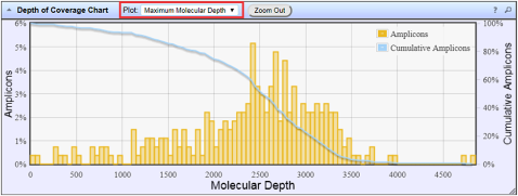 Figure 1. Representative Depth of Coverage Chart
The Depth of Coverage Chart summarizes the amplicon depth of coverage results. The X‑axis represents the amplicon molecular depth. The left Y-axis represents the number of amplicons at a given molecular depth or a range (bin) of molecular depths, as a percentage of the total number of amplicons. The right Y-axis represents the cumulative count of the number of amplicons, at a given molecular depth or greater, as a percentage of the total number of amplicons. The individual orange bars represent the percentage of amplicons in the specific range of molecular depths. The blue curve measures the cumulative amplicons at a given molecular depth or greater. Use the Plot dropdown list to switch between Maximum Read Depth, 99.9% of All Reads, and Normalized Coverage plots.
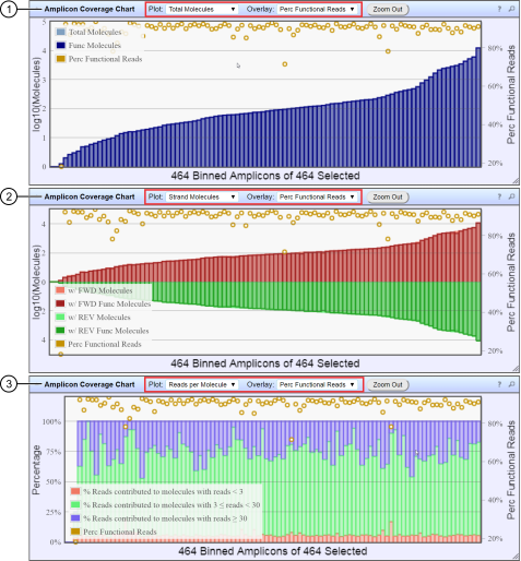 Figure 2. Representative Amplicon Coverage charts
The Amplicon Coverage charts summarize the amplicon molecular coverage results. The X‑axis in all plots represents amplicons that are grouped into bins, where each bin contains amplicons that have the same molecular coverage. Depending on the plot selection, the left Y‑axis represents either the average number of molecules (on a base 10 log scale) or the percentage of functional molecules in a given bin. The right Y‑axis represents the percentage of functional reads in a given bin. Use the Plot and Overlay dropdown lists to customize the chart view.
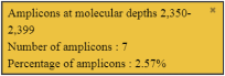
 Figure 3. Example detail panes
In most plots, you can click a data point to open a detail pane for that data. For example, in the Depth of Coverage Chart in Figure 1, click an individual orange bar to open the detail pane for amplicons in a specific range of molecular depths or click a point on the blue curve to open the detail pane for cumulative amplicons at that molecular depth or greater. Similarly, you can click any point or bar within each Amplicon Coverage chart to view details for each amplicon coverage bin. For example detail panes, see Figure 3.